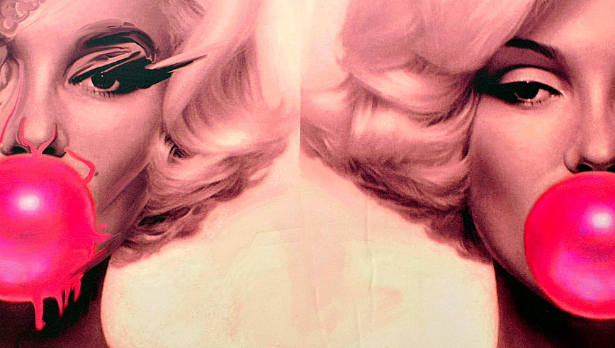
Pink is an outrageous color.
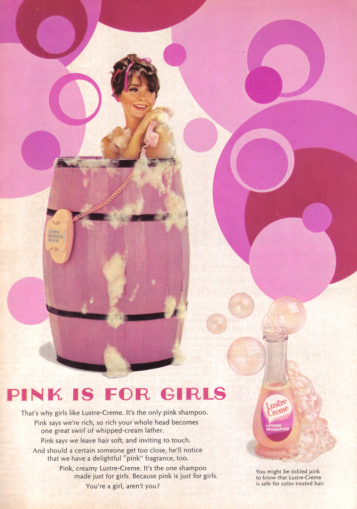
Liberated from the “feminine care” aisle, you take a little pink box into the bathroom. You remove the device from its packaging, urinate, and wait for those tell-tale pink lines. As an expectant parent, everyone will wonder, girl or boy? Pink or blue? Because when it comes to the color pink, whether used traditionally, humorously, or ironically, pink remains emblematic of the double X chromosome. It is associated with babies, little girls, femininity, softness, and superficiality; hence the “feminine care” aisle’s pink palette.
Pink is associated with genitals, sexual intercourse, and sexuality. While the pink packaging on that pregnancy test don’t tell you if you are having a boy or a girl, they do tell you one thing: pink is a physically charged color. Pink is a sex symbol.
In the 1980s, with the advent of prenatal testing, parents quickly became fixated on their child’s sex (or really, their genitalia), and this foreknowledge fueled existing sexist color coding. In 1985, Luvs introduced pink and blue disposable diapers that featured slightly different padding for “boys” (in-front) and “girls” (in the middle). Prior to 1900, most infants in the United States wore white clothing, regardless of sex. These white ensembles signified a child’s age, while colorful accents were often based off of a child’s physical characteristics—brunettes wore pink; blondes dressed up in blue.
With the twentieth century’s infatuation with colorful baby clothes, the emphasis shifted from age to sex. As the blogger “Distracted Daddy” wrote in a post on his daughter’s all pink outfits, “hopefully once she is no longer a baby and any stranger can guess her gender at forty yards away, we can move on from this color.”
Pink, as a color in fashion, first appeared in the French royal court of the eighteenth century. From the Palace of Versailles this color spread throughout the Western World and was regarded not as an infantile color, but a “courtly and royal” pigment appropriate for clothing elite men and women alike. Ascending the throne in 1715, Louis XV’s mistress, Madame de Pompadour, cultivated pink as her favorite color.

In her portrait by François Boucher, Jeanne-Antoinette Poisson, Marquise de Pompadour, is at her toilette in the act of “pinking.” This facial flush, usually associated with sexual arousal or intense emotion is, however, painted on—Madame Pompadour’s compact of blush and powdered brush reveal that her appearance is cosmetic and manufactured, however desirable.
Following the synthetic production of very bright, almost garish pinks, pink became a color at home in both “high” and “low” culture. Costume designers throughout the 1950s and ‘60s utilized pink in musicals as chromatic eye-candy, outfitting the sexually confident female or traditionally feminine woman in pink clothing.
The 1957 romantic comedy Funny Face, features a stalwart magazine editor directing “women everywhere to ‘think pink.’” In addition to handbags and shampoo, “think pink’s” song and dance sequence included an homage to Jean-Honoré Fragonard’s The Swing (1767), with a slow-motion shot of a girl on a swing dressed head-to-toe in—you guessed it, pink.
A positive pink theory was studied in the Baker-Miller experiment. Baker-Miller, a shade of pink created by mixing red and white, was painted in the holding cells of naval facilities in 1970 by the biosocial researcher Alexander Schauss. Also known as “Drunk Tank Pink,” the experiment showed that the color lowered prisoners’ heart rates and decreased physical aggression. Centuries later, scientists and social historians remain obsessed with pink’s capacity to activate the human psyche, or produce psycho-emotional responses.
Hollywood’s infatuation with the potentiality of technicolor was one part of larger national sentiment; America was “in the pink” with postwar prosperity, giddy that the war was over and ready for some serious shopping. The same year Funny Face premiered on the silver screen, Hollywood’s bombshell, Jayne Mansfield, purchased “the Pink Palace,” complete with a ceiling-to-floor pink shag carpeted bathroom. But Mansfield wasn’t the only celebrity being enveloped in pink. Singer, songwriter, and actor, Elvis Presley, not only wore pink suits, jackets, and trousers, he also drove a pink car and slept in a pink bedroom.
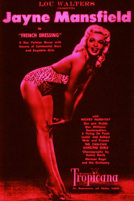 Sex icons, both male and female, were channeling pink’s promise of prosperity and positivity. When asked why pink, Mansfield reflected, “because it made me happy.” This “pink effect” materialized at a party celebrating Mansfield’s pink swimming pool, in which she filled it to the brim with pink champagne.
Within that year, An Affair to Remember starring Cary Grant and Deborah Kerr premiered in cinemas with a pink opening title sequence and a featured specialty cocktail: pink champagne. The film begins with Grant and Kerr on a cruise from Europe to New York, and despite being engaged to other people, they decide to have an affair on board with all the characteristics of pink champagne, “fun, light, and enjoyable.”
But even with the nation’s collective intoxication with this rosy hue, pink was, and remains, a divisive color with contentiousness, coloring newspapers throughout the mid-twentieth century.
In 1950, Helen Gahagan Douglas, a blue-blooded Broadway star turned politician, would go head-to-head against Richard Nixon for a seat on the U.S. senate in the state of California. During the political campaign—due to her close ties with communist sympathizers within the movie-industry—a San Jose newspaper reported that if Douglas was not exactly red, she was “decidedly pink.” Pinko quickly became a noun for someone soft on communism.
Throughout the election, Nixon’s team printed damaging propaganda in opposition to Douglas on pink paper. These “pink sheets,” along with Los Angeles Daily News’ printing of the nickname “Pink Lady,” colored Douglas’ political career. Tricky Dicky famously declared that Douglas was, “pink right down to her underwear;” his off-color comment positioned pink as both a political pejorative (communist sympathizer) and illicitly sexual.
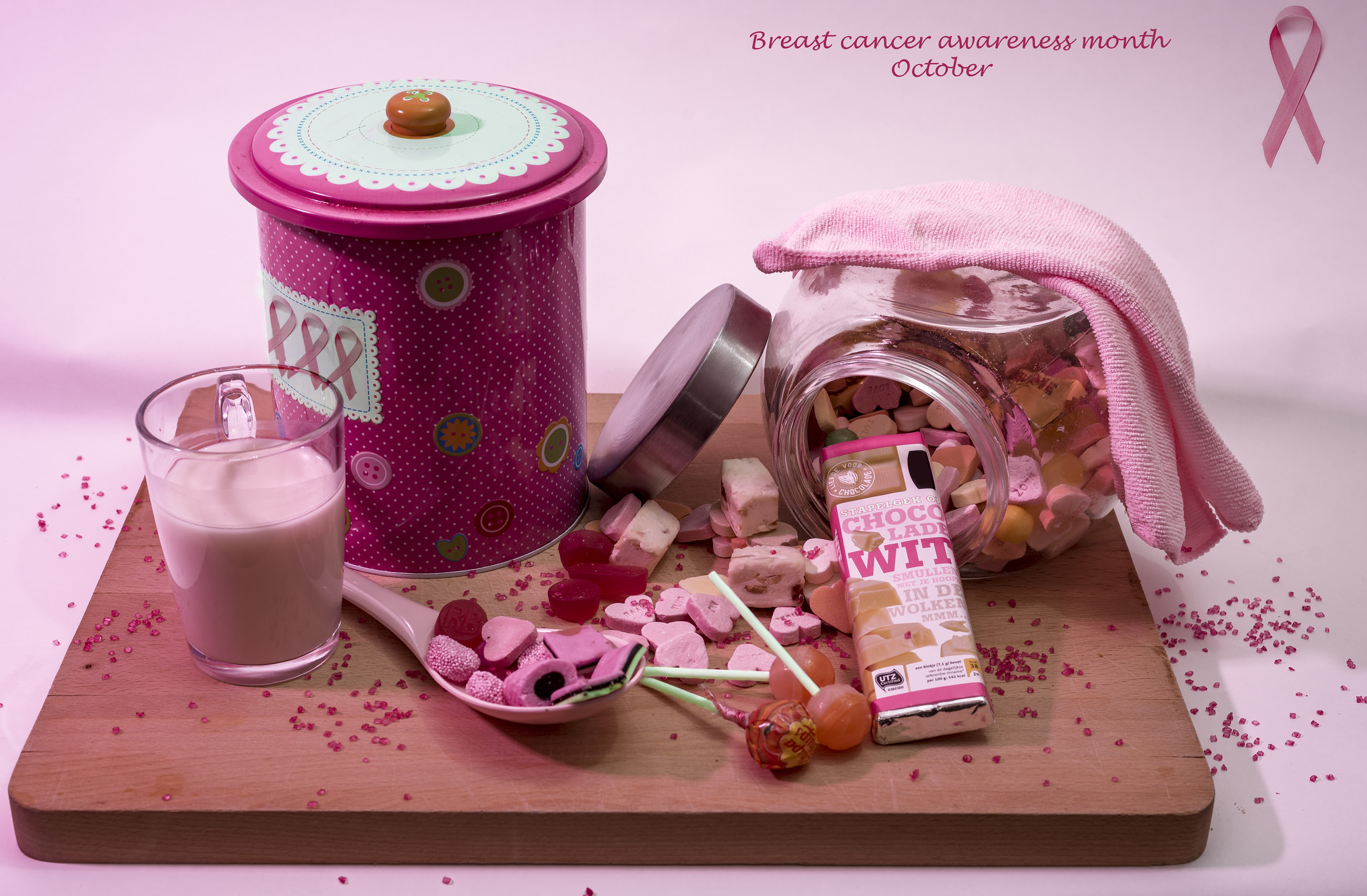
In 1991, Susan G. Komen handed out pink ribbons to runners in the New York City Survivor Race. The ribbon, designed by Evelyn Lauder of the Estée Lauder Companies in collaboration with an editor at Self magazine, was influenced by HIV and AIDS organizations’ red ribbon. That same year, 1991, the Visual AIDS Artists’ Caucus created “The Ribbon Project.”
The artist driven organization had tried to stay away from colors traditionally associated with homosexuality, but in Germany, male sex workers were referred to as Rosarote, which literally translates to “pink-red.” This colorful nickname was also the inspiration behind the pink triangle assigned to gay and lesbian inmates in concentration camps during World War II.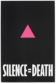
Over the years, the connotation of pink with the sexually transgressive has been reclaimed by activists (queer and straight), into a symbol of resistance. Yet, Gayle Sulik, author of Pink Ribbon Blues: How Breast Cancer Culture Undermines Women’s Health sees pink as a reinforcer of “the notion that breast cancer is a danger only because it threatens women’s sexual identity and men’s access to their breasts.”
Breast cancer’s pink ribbon not only defines it as a woman’s disease, it emphasizes notions of traditional femininity as it relates to the female body, specifically the nipples on a white human female’s breasts. As Gemma Tarlach writes, “nowhere, perhaps aside from Hooters, is the equation more ingrained than in the breast cancer industry…woman=breast=pink.”
This juxtaposition of pink’s association with heightened femininity and underlying sexuality was embraced in “millennial pink.” The early 2000s saw female empowerment books employ pink in their cover art at around the same moment women were being taught to wear pink on Wednesdays.
This “ironic pink” attempted to extract the sugary sweetness of Malibu Barbie and replace it with the girl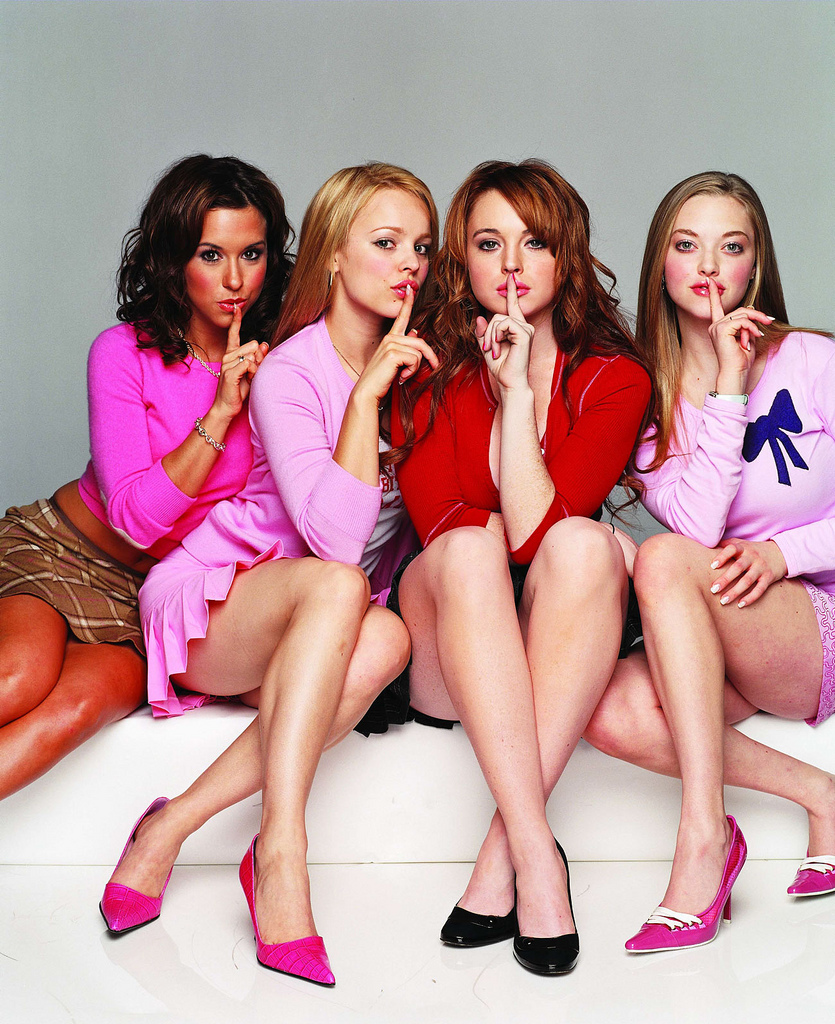 boss attitude of the Plastics from Mean Girls. Despite the rebrand, millennial pink’s not-for-little girls-ness carries with it the color’s storied sexual past.
On January 21st, 2017, 500,000 men and women, young and old, walked in The Women’s March on Washington, D.C. Throughout the day, news channels and social media sites broadcasted images showcasing the diversity of the march’s participants, but the photos also captured the movement’s clearest demarcation of empowerment and protest: the color pink. The leading article of clothing that contributed to this “pink effect” was the Pussyhat.
When asked about the pussy hat’s signature color, co-founders Krista Suh and Jayna Zweiman, said, “wearing pink together is a powerful statement that we are unapologetically feminine and we unapologetically stand for women’s rights.” But not everyone felt the choice of pink, or the “pussy hat,” was the ideal icon for the Women’s March. Washington Post columnist Petula Dvorak wrote a public address to her “sisters,” stating, that the “cute and fun” color threatened to trivialize women’s issues

In an effort to belittle President Donald Trump’s proposed Southern border wall, a group of interns at the architecture film Estudio 3.14 created 3D renderings of the wall. The “Prison-Wall Project,” allowed the public to see just what Mr. Trump’s “big,” “beautiful,” and “physical,” wall might look like. The designers’ concept? A bright pink wall that doubles as a prison.
As the President stated that Mexico will pay for the wall, the designers’ model pays homage to the Mexican architect Luis Barragán, most known for his pink-colored geometric buildings throughout Mexico. Barragán once referred to his pink floorplans as “architectural stripteases.” At Estudio 3.14, the pink design is not only nationalistic, its color undresses the American dream. It is the embodiment of Trump’s wall in all “its gorgeous perversity.”

Pink, as a wall, or a mark on a pregnancy test, is a contentious line carrying alone within it the diacritical distinction pink/blue. Girl or boy. As the beauty expert Eve Nelson wrote in her novel, Take It From Eve, “while it’s true that she [a female infant] cannot actively appreciate a pink ribbon…these things set the mood.” This belief in the formation of a feminine personality from early childhood exposure to pink, was condemned throughout the uni-sex era of the 1970s by mothers who viewed the gendered clothing of their early twentieth century upbringing through the lens of second-wave feminism. Despite these anti-pink crusaders, pink’s stereotypes remain salient, even when contradicted in practice.
The Pink Tax, named after the color of products that are marketed to attract women and girls, refers to the price difference for female-targeted commodities compared to male or “gender-neutral” goods. On average, products for women or girls cost seven percent more than comparable products for men and boys. The Bic pen “For Her” is just one example of this prevailing sexist consumer culture. Designed for women, with a comfortable rubber grip for “female hands,” the pen demonstrates pink’s complex cultural history built, in large part on, sexual biology.
This “pink double-standard” found adoring fans in the American animated television series Jem and the Holograms. By day, Jerrica Benton was the owner of a music company, by night, she was Jem, lead singer of the Holograms. On television and on toy shelves, Jerrica and Jem wore pink.

Within the show’s narrative, pink linked Jerrica and Jem’s secret identities, and boldly showed pink as a color like none other—an innocent, yet honest representation of pink’s dualism in art, fashion, cosmetics, politics and pop culture. This notion of a color having two sides (natural and unnatural, virginal and virile, or male and female) was parodied in a 2005 Robot Chicken episode where Jem, dressed in her iconic pink wrap dress, is caught using a urinal in the men’s restroom.
As a color frequently found in flowers, alcohol and sweets, quartz crystals, a setting sunscape, genitalia, skin tones and discoloration, pink’s connotations take inspiration and innuendos from the physical world—it is a color with physicality. The use of pink as a current political statement in response to our contemporary government or as the latest trend, draws upon the versatility of pink’s associations, it’s intrinsic connection to the human condition, and its ability to arouse our sense of smell, alter our outlook, tantalize our taste buds, evoke our childhoods, or elicit a sense of touch.
It’s truly an outrageous color.

